Template Settings Interface:
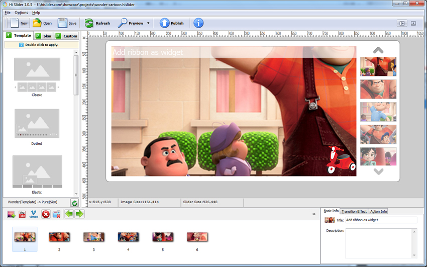
In the Template Settings interface, you will see the main design tools and the effect of unprocessed image slider. There are 4 main design modules for you to build amazing jQuery image slideshow: Template, Skin, Custom Settings and Page Manager.
1. Template Settings
2. Skin Settings
3. Custom Settings
4. Page Manager
5. Other Settings
1. Template Settings:
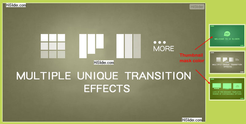
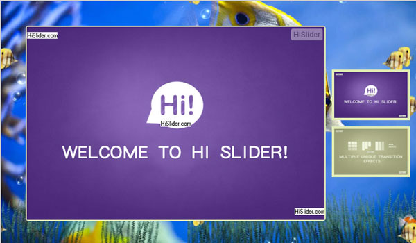
In the Template setting interface, there are 10 different templates for you to apply for the slider: Classic, Dotted, Elastic, Eris Horizontal, Fly, Full, List, Slidorion, Versatile and Wonder.
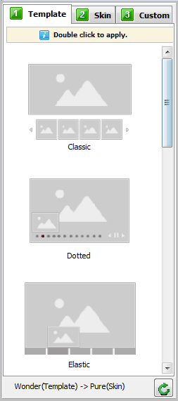
Each template has different features and vision.
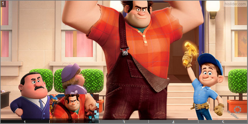
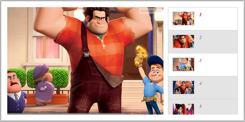
Classic: Display thumbnails at the bottom and offer retractable caption.
Dotted: Awesome jQuery image slider template with powerful custom tools.
Elastic: Numbered thumbnails with reflection.
Eris Horizontal: Sliding thumbnails on mouse move over.
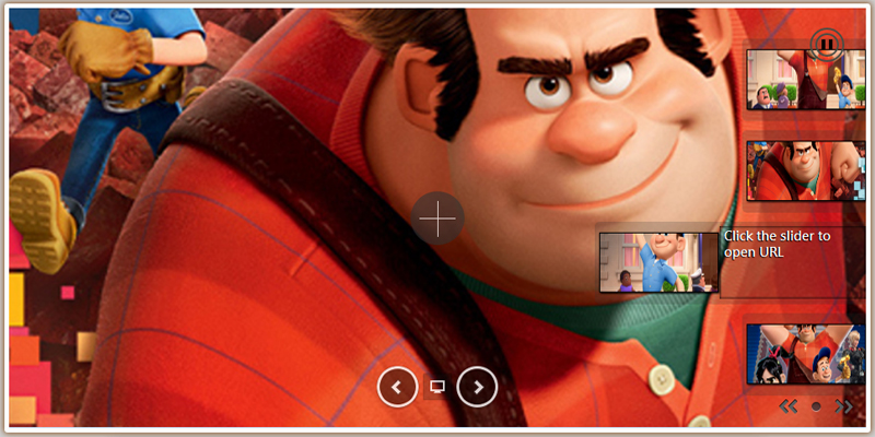
Fly: Dynamic pop-up thumbnails when mouse hover over.
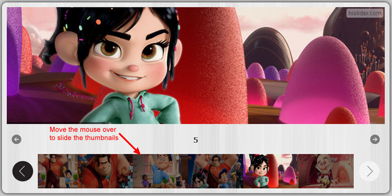
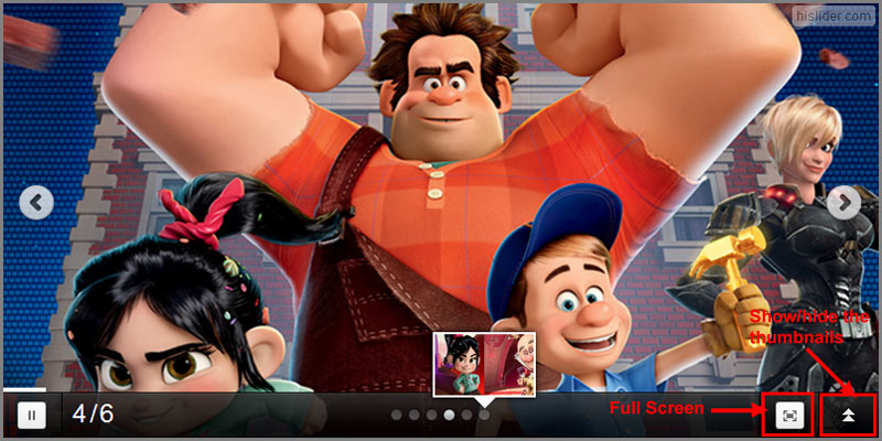
Full: You can show or hide the thumbnails with ease.
List: List the thumbnails on the right or left side.
Slidorion: Introduce accordion-style thumbnails.
Versatile: Provides versatile features to create versatile slider.
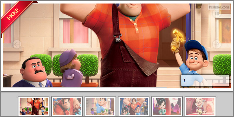
Wonder: With Thumbnails on the right side and allows you to add decorative widgets at left top and right bottom.
For more info about the templates, you can go to : http://www.hislider.com/templates/dotted/dotted.html.
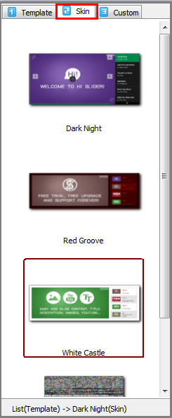
2. Skin Settings:
Each template provides you with multiple skins; you can choose one from them and apply for the gallery slideshow. Below is the screenshot of the skins of Classic Template:
3. Custom Settings:
Different template has different features, which means that different template provides different custom settings. Still, they have common settings. Here we take Children Template as an example.
(1). Basic Settings
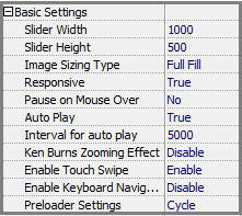
i. Slider proportions
You can customize width and height for the slider by simply inputting parameters. By readjusting the proportions, you will also change the outlook of other modules such as thumbnails.
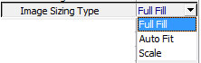
ii. Image Sizing Type
There are three types to display the imported images: Full Fill, Auto Fit and Scale.
iii. Responsive
Choose "True" to enable the output slider to response to different devices and screens by automatically resizing.
iv. Pause on Mouse Over
Choose "Yes" and you can stop the auto slide when you move the mouse over the slider.
v. Auto Play
vi. Interval for Auto Play
Set interval (the time range for each slide to display) for the slides.
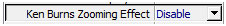
vii. Ken Burns Zooming Effect
Ken Burns Effect is a popular special effect that pans across an image or zoom in and out of an image while the slider plays.
Disable Ken Burns Zooming Effect
Enable Ken Burns Zooming Effect
viii. Enable Touch Swipe
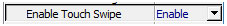
Enable this feature to enable touch swipe to view the slider on mobile devices such as iPad and Android. Besides, in Classic Template, you can pinch to spread or draw back the caption.
ix. Enable Keyboard Navigator
You can enable the Keyboard navigator so you can turn the slide pages with keyboard arrows.
x. Preloader Settings
If you want to use a unique preloader for your slider, you can use the Preloader settings. There are two types of preloader for you choose: Basic and Cycle.
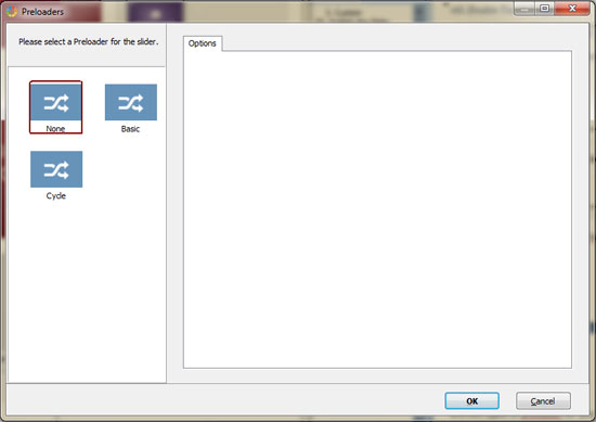
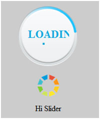
a. Basic Preloader:
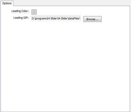
You can select a background color for the loading page, and select a GIF image for the loader. Below is what the basic preloader looks when loading the slider.
b. Cycle Preloader:
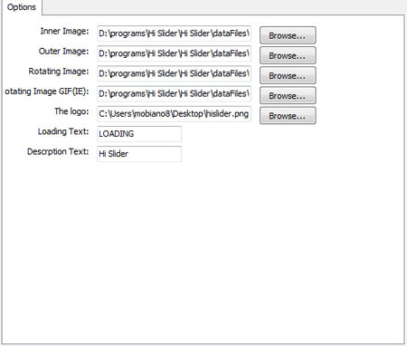
Cycle Preloader provides different options for you to customize the preloader: inner image, outer image, rotating image, rotating image GIF(IE), logo, loading text and description text. Below is a customized Cycle Preloader.
(2). Thumbnail Settings
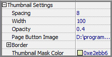
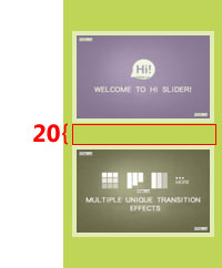
i. Spacing
The interval between two thumbnails. For example, you can set it as 20, then you will see the change.
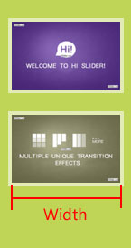
ii. Width
The width of the thumbnails. If you change the width of the thumbnails, the height will change accordingly.
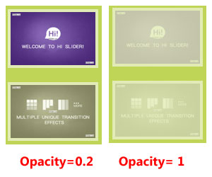
iii. Opacity
You can set the opacity (0-1) of the thumbnail, the larger the value is, the more opaque the thumbnail will be.
iv. Page Button Image
You can use a special image as the page button of the thumbnails.
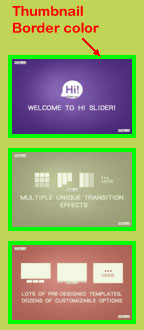
v. Border
Customize the border of the thumbnails with different settings: Border color and proportions.
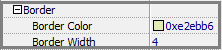
a. Border Color
Select the border color for the thumbnails.
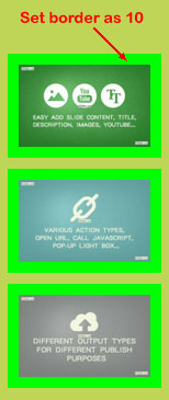
b. Border Width
You can change the border proportions for the thumbnails by changing the value. For example, set it as "10".
vi. Thumbnail Mask Color
Select a color for the mask of the thumbnails; you will see the thumbnails (except the currently displaying one) covered with a mask.
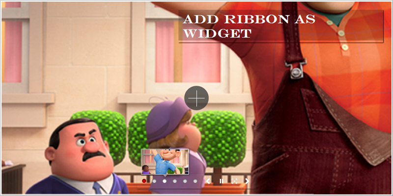
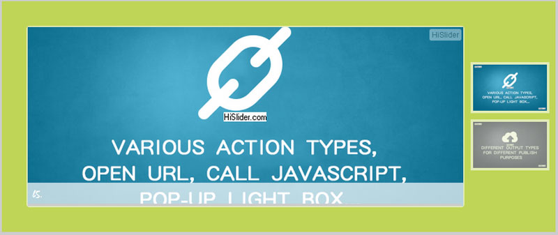
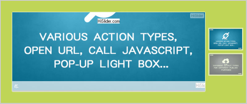
(3). Caption Settings
You can add caption for the slider, including title and description. Then while displaying the slider, the caption will show up.
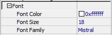
i. Font
You can set the font for the caption: font color, size and type. Choose the right one to fit your slider.
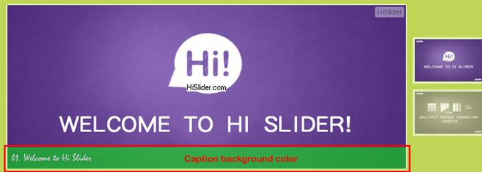
ii. Background

Change the background color and opacity for the caption to stand it out.
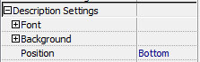
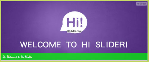
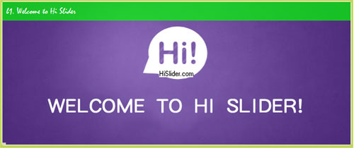
iii. Position
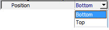
You can set the caption at the top or bottom of the slider.
Bottom:
Top:
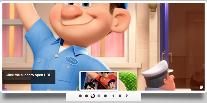
(4). Control Settings
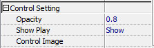
i. Opacity
Set opacity (0~1) for the control buttons, the larger the value is, the more opaque the control buttons will be.
ii. Show Play
You can enable the Play/Pause button to play or stop auto play.
iii. Control Image
Choose the image of the control buttons (Play, Pause, Prev, Next).
(5). Template Settings
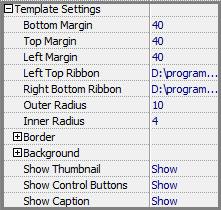
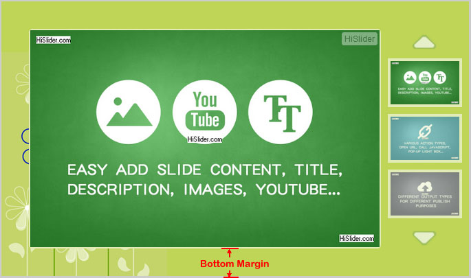
i. Bottom Margin
Set the bottom margin for the slider. If you set margin for the slider, the background can be seen. This can make the slider looks more beautiful.
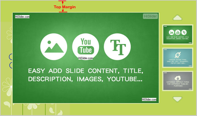
ii.Top Margin
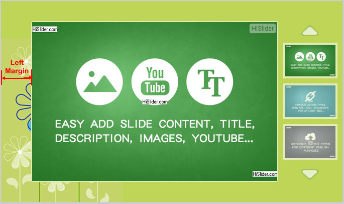
iii. Left Margin
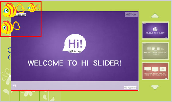
iv. Left Top Ribbon
You can add images at the left top as Ribbon.
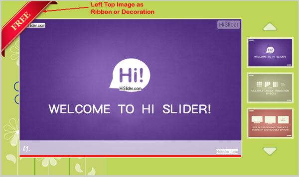
Or you can choose an image as decoration.
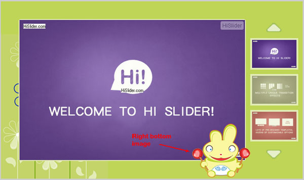
v. Right Bottom Ribbon (Children Template)
In Children Template, you are able to add more than one decorative image. In addition to the Left Top image, you can also add a Right Bottom image.
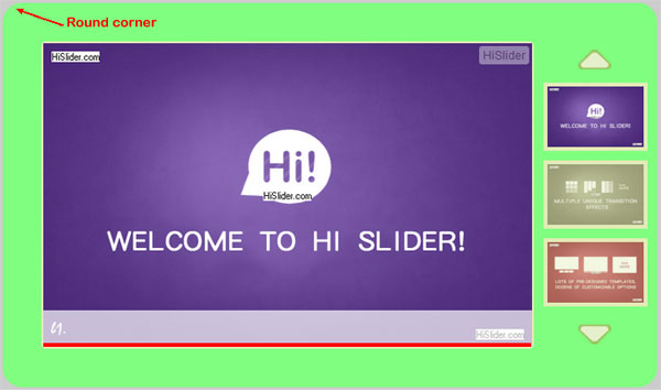
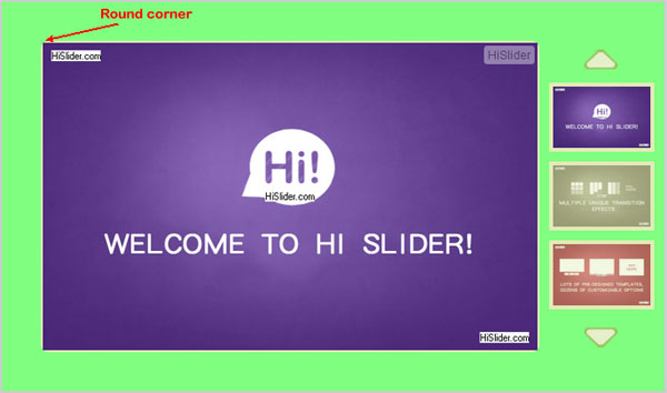
vi. Outer Radius
If you don't like the slider with square corners, you can set the corners as round corners by changing the radius of the outer frame.
vii. Inner Radius
In addition to changing the outer frame corners, you can also set the inner frame corners as round ones.
viii. Border
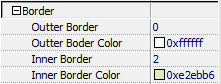
a. Outer Border
You can set border for the slider, input value to define the border width.
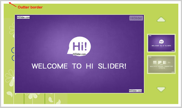
b. Outer Border Color
Select the color for the outer border.
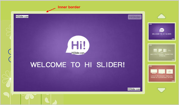
c. Inner Border
Also, you can set border for the inner frame.
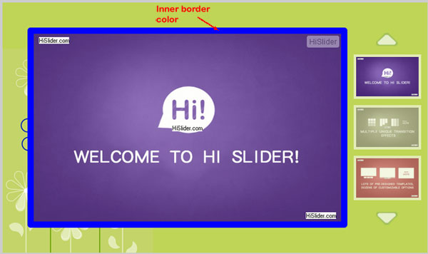
d. Inner Border Color
Change the border color of the inner frame.
ix. Background
You can change design the background of the slider to make it more attractive.
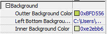
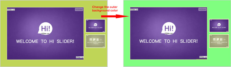
a. Outer Background Color
If you don't like the current background color of the outer frame, you can change it.
b. Background Image
If you don't want to use pure color as the background, you can add background image. Please note that if you want the background image full fill the slider, you should choose image according to the slider size. Otherwise, the background image will just display at the left bottom of the slider, just like a decoration; or if the image is too large, it will show only a part of it.
c. Inner Background Color
Also, you can change the background color of the inner frame.
x. Show Thumbnail
You can navigate through the slider more easily with the help of the thumbnails, however, if you don't want it to display in the slider, you can select "Not Show" to hide the thumbnails.
xi. Show Control Buttons
Show or hide the control buttons: Play/Pause, Prev page, Next page.
xii. Show Caption
Show or hide the caption of the slider, including title and description.
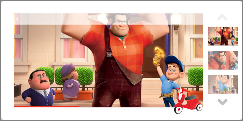
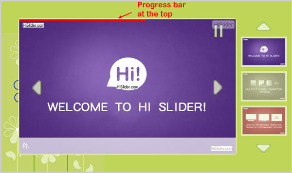
(6). ProgressBar Settings
The Progress bar shows the progress of each slide in Auto Play mode.
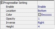
i. Enable
Choose to enable or disable the Progress bar.
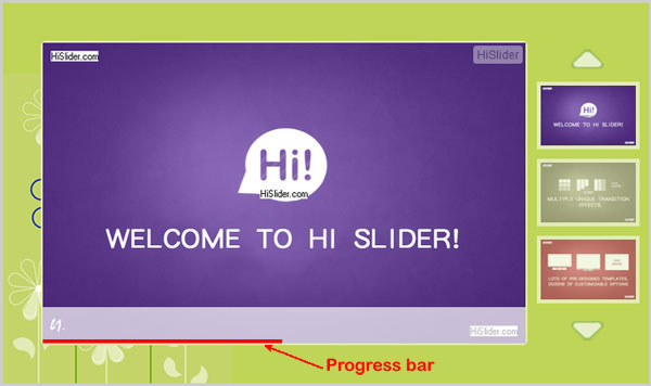
ii. Position
You can set position of the Progress bar, at the bottom or at the top.
iii. Color
Change the color of the progress bar.
iv. Opacity
You can change the opacity of the progress bar, the value is from 0 to 1, if you set the value as 0, then the progress bar will become pale.
v. Inverse
Select "Right" then the progress animation starts from left to right; select "Left" then the progress animation reverses from right to left.
vi. Height
If you change the height of the progress bar, visitors can see it clearly.
4. Page Manager
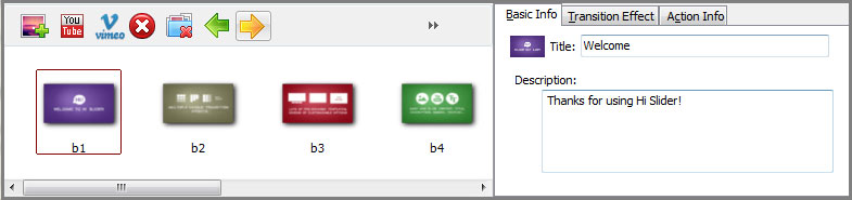
You can use Page Manager to manage the slides and content of the slider with ease, this Page Manager is in fact the same as what we mention in Part V (Add Slides Interface). You can add or delete images, YouTube videos or Vimeo videos, re-order the slides, add basic info, set transition effect in advanced info, and trigger actions in Action info settings.
5. Other Settings
In the "File" menu at the top left, there are several useful setting.
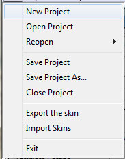
(1).Save Project (As) & Open Project:
If you want to edit the current project later, you can save the project first. Then you just need to click "Open Project" to browse the project you saved and you can continue editing it.
(2).Export & Import Skins
If you want to use the current settings in other sliders, then you can export the settings as Skin, and when you design other sliders, you can apply the current settings to other sliders simply importing the Skin project.
Export Skin:
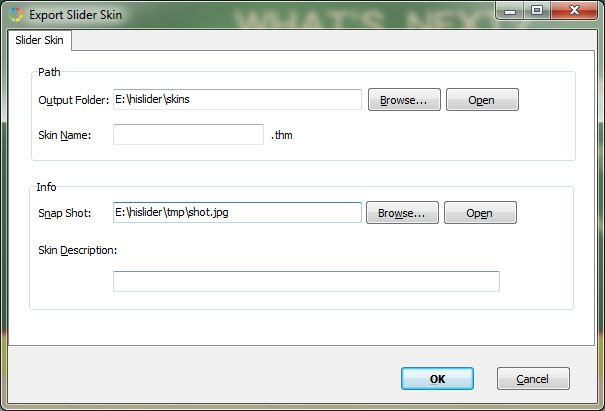
You can choose output path and define the Skin name, or even select icon and define description for the exported skin project.